Edward Tufte's forum on visualisation issues, including Project Management graphics and the terrible Gantt chart. I scoured the latter for inspiration on the strategic project visualisation idea – previous post. Lots of ideas but mainly too tactical.

Check out Sparklines "word-like display of data": nice example here at NASA Ozone Hole Watch (that sounds so much more urgent than Ozone Layer Survey). They say this is sparklines-inspired rather than the true in-text sparklines.

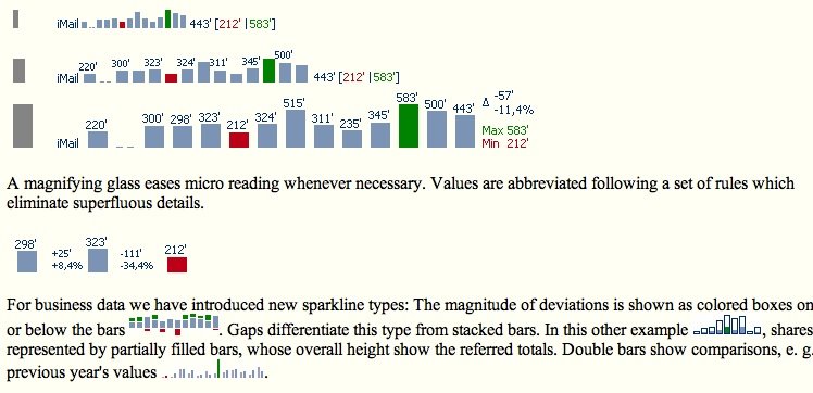
Here's a more on-message sparkline from a company called Bissantz, who do software to create Truetype fonts for this.
The latter also claim to implement yet another bright idea I had in the bath – audible data playback! Should we call it audioisation?
Several of the Tufte forums are going straight into the feedreader. For one thing, I'll know when his new book will be ready.
No comments:
Post a Comment