It's like I keep saying, it depends. If you want to tell people about something, and don't want no argument, you should probably draw it up neatly in a language they understand.
Visual grammars are somewhat mysterious though, as the following example will I hope show.
If you want to work something out visually, a modeller is going to want to use a live, computer-based representation of their problem. The richer the better as far as a modeller is concerned. They are happy to learn the details and spend days playing with the configuration of the diagram. Being a proud sort, they will bring it to the meeting and say look at this, play with it. I've seen instances of this where the above-average-intelligence audience have been interested in the problem, wanting to contribute, but have been struck dumb by the strangeness of the notation. Uh dunno, you do it mate report back when it's finished. Next Agenda item please.
Tragic. The investment in learning visual language is never made properly.
That's why I like stealthy visual grammars, that emulate the anything goes world of the flip chart and sticky note. They are much more amenable to debate and contribution.
If you want to involve people in a group, you need a visual language that's approachable by them. You can't just say "oh it's UML, get with it", you have to make allowances.
Take a look at Nick Duffill's these two diagrams from the Beyond Crayons blog (also refers to Patrick Mayfield's little article on visual mapping in Systems Thinking).
See how in Nick's comparison, the second diagram looks more rigid, and less likely to be argued with. He also makes the point that the tree-like diagram obviously goes somewhere (the Outcome) rather than its wiggly predecessor.
Incidentally, he calls these Open Systems and Closed Systems but I don't think that nomenclature is quite right. He's referring to whether the system state evolves as a whole or whether things keep going forever. Essentially one diagram shows forces, and no state, and the other shows some forces, and a big change of state. Different objects, as well as a different grammar.
Very often these models are faulty on first presentation, but somehow the apparently finished state - signalled by the neat lines - is off-putting. The reaction could be "that's a bad model take it away" rather than "you missed this bit out HERE let me fix it".
Showing posts with label visualisation. Show all posts
Showing posts with label visualisation. Show all posts
Tuesday, July 18, 2006
Tuesday, April 04, 2006
Tufte Forum
Why hadn't I seen this before?
Edward Tufte's forum on visualisation issues, including Project Management graphics and the terrible Gantt chart. I scoured the latter for inspiration on the strategic project visualisation idea – previous post. Lots of ideas but mainly too tactical.
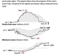
Check out Sparklines "word-like display of data": nice example here at NASA Ozone Hole Watch (that sounds so much more urgent than Ozone Layer Survey). They say this is sparklines-inspired rather than the true in-text sparklines.

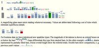
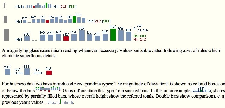
Here's a more on-message sparkline from a company called Bissantz, who do software to create Truetype fonts for this.
The latter also claim to implement yet another bright idea I had in the bath – audible data playback! Should we call it audioisation?
Several of the Tufte forums are going straight into the feedreader. For one thing, I'll know when his new book will be ready.
Edward Tufte's forum on visualisation issues, including Project Management graphics and the terrible Gantt chart. I scoured the latter for inspiration on the strategic project visualisation idea – previous post. Lots of ideas but mainly too tactical.

Check out Sparklines "word-like display of data": nice example here at NASA Ozone Hole Watch (that sounds so much more urgent than Ozone Layer Survey). They say this is sparklines-inspired rather than the true in-text sparklines.

Here's a more on-message sparkline from a company called Bissantz, who do software to create Truetype fonts for this.
The latter also claim to implement yet another bright idea I had in the bath – audible data playback! Should we call it audioisation?
Several of the Tufte forums are going straight into the feedreader. For one thing, I'll know when his new book will be ready.
Monday, April 03, 2006
Strategic process models
Strategic thought about future projects needs to be accurate, but because of the innate uncertainties the area is resistant to usable models.
Why model strategically? I'm looking for some way of preparing thought at the stage of the business case (the full one not the bean counter's profit statement) or the research proposal. We need to know what's connected to what, and what gaps exist. We need exact knowledge of uncertainty. We don't want to commit to tasks and sequences yet, but we do want to shake out the structure of organisational relationships with the underlying technology.
The tactical level is well-trampled, principally by the Gantt chart. For discussion of some of its deficiencies and some possible alternatives, we'd better Ask Tufte. However, the strategic, beginning level of projects is airy fairy whiteboard stuff, the fuzzy front end.

Snagged from a somewhat random US army document about process modelling.
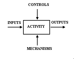
This is the commonly used ICOM model, a Lego brick of many process model formalisms. I'm trying to think how it could be used in a strategic-level project modelling system.
Inputs and Outputs of generic activities are obvious elements to model, but we don't want to imply that a task is done once. Rather like a diagram of body parts, we want to infer circulation and iteration of knowledge and materials between connected parts.
Instead of Mechanisms and Controls, we can use the vertical faces of an activity node to represent Resources and Constraints respectively. We can utilise this in a mapping scheme to show contributing organisations arrayed along the base of the diagram and customer/external organisations in the upper part.
Ideally I'd like to connect this to hard data (tables) about the connectedness and certainty of each of the elements. I'd like to take the drudgery away from the drawing aspect, and have the ability to do basic traceability and completeness analyses on the strategic model.
Sound good? Next week I'll draw a few.
Why model strategically? I'm looking for some way of preparing thought at the stage of the business case (the full one not the bean counter's profit statement) or the research proposal. We need to know what's connected to what, and what gaps exist. We need exact knowledge of uncertainty. We don't want to commit to tasks and sequences yet, but we do want to shake out the structure of organisational relationships with the underlying technology.
The tactical level is well-trampled, principally by the Gantt chart. For discussion of some of its deficiencies and some possible alternatives, we'd better Ask Tufte. However, the strategic, beginning level of projects is airy fairy whiteboard stuff, the fuzzy front end.
Snagged from a somewhat random US army document about process modelling.
This is the commonly used ICOM model, a Lego brick of many process model formalisms. I'm trying to think how it could be used in a strategic-level project modelling system.
Inputs and Outputs of generic activities are obvious elements to model, but we don't want to imply that a task is done once. Rather like a diagram of body parts, we want to infer circulation and iteration of knowledge and materials between connected parts.
Instead of Mechanisms and Controls, we can use the vertical faces of an activity node to represent Resources and Constraints respectively. We can utilise this in a mapping scheme to show contributing organisations arrayed along the base of the diagram and customer/external organisations in the upper part.
Ideally I'd like to connect this to hard data (tables) about the connectedness and certainty of each of the elements. I'd like to take the drudgery away from the drawing aspect, and have the ability to do basic traceability and completeness analyses on the strategic model.
Sound good? Next week I'll draw a few.
Subscribe to:
Posts (Atom)